Monday, June 4, 2012

Animals in Our Lives


                Upon a recent trip to the MoMA, I took the role of a curator and attempted to put together an exhibition based on animals from all over the world, since the artwork I would be using was from artists all over the world. I used artworks from different departments of the museum, such as the Media and Performance department, the Prints and Illustrated Books department, the Painting and Sculpture department, and also the Drawing department.
                The first piece that I came across that captured my attention was "She-Goat" by Pablo Picasso from the Painting and Sculpture department. This specific piece caught my attention because of the dark-colored bronze it was made of. I feel the bronze of this piece helps depict some of the details such as the protruding udders of the goat that also help define the femininity of the piece. Being the first piece that captured my attention, it also gave me an idea of what to look for specifically in the rest of the pieces  I would include in my6 exhibition. This piece helped me decide that I would use not only animals as we humans see them, but also as they are seen through artist's perspective.
                "Baboon Bride" by Chris Finley is another excellent example of seeing an animal through an artist's perspective. This work of art, part of the Drawing department of the museum, gives a great, almost humorous tone. The whaling baboon in the wedding dress immediately makes me think of women who become beast-like during the planning of their weddings. The way the gowned baboon is sitting in this drawing also immediately makes me think that it is in the middle of a very loud tantrum. It makes me wonder if Finley's intentions were to spark up thoughts much like mine. To me, it is a brilliant piece and I would definitely use this piece.
                On a more realistic note however, the film "Cat" by Roman Signer from the Media and Performance Art department, I feel would also be a great addition to the collection I was putting together. This is because I feel by creating a tie between realistic artworks and those from the imaginations of artists, we can really learn to appreciate the beauty of the animals around us, whether they be household pets or animals from exotic lands. The film, which is nothing out of the ordinary, really fits in with the other realistic pieces I have chosen.
                As mentioned before, the tie between both realistic and surreal pieces for my collection really helps enhance the beauty of the nature in the animals of each piece. They also help highlight the similarities between humans and animals, creating a mental bond that really gets your gears working. The overall experience of becoming a curator, actually made me consider it as a career choice. I wouldn't mind choosing pieces that would really get into the minds of audiences around me for a living.


Finley, Chris. "Baboon Bride" 1953. Drawings. 

Broodthaers, Marcel. "Belgian Lion" 1968. Paintings and Sculptures.

Buchanan, Nancy. "California Stories" 1983. Media and Performance

Goben, Robert. "Cat Litter" 1989. Paintings and Sculpture. 

Signer, Roman. "Cat" 1979. Media and Performace

Kahlo, Frida. "Fulang-Chang and I" 1937. Paintings and Sculptures.

Chagall, Marc. "I and the Village" 1968 Paintings and Sculpture

Viola, Bill. "I Do Not Know What it is I am Like" 1986. Media and Performance 

Mino, Joan. "Object" 1936. Painting and Sculpture

Broodthaers, Marcel. "Pot of Mussels" 1968. Paintings and Sculpture

Picasso, Pablo. "She-Goat" 1950. Paintings and Sculpture

Gauguin, Paul. "Still Life with Three Puppies" 1888. Paintings and Sculpture

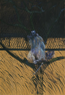
Bacon, Francis. "Sudy of a Baboon" 1953. Paintings and Sculpture

Liam, Wilfredo. "The Jungle" 1943. Drawings

Chapman, Jake. "Untitled from Exquisite Corpse" 2000. Prints and Illustrated Books. 


Animals in Our Lives


                Upon a recent trip to the MoMA, I took the role of a curator and attempted to put together an exhibition based on animals from all over the world, since the artwork I would be using was from artists all over the world. I used artworks from different departments of the museum, such as the Media and Performance department, the Prints and Illustrated Books department, the Painting and Sculpture department, and also the Drawing department.
                The first piece that I came across that captured my attention was "She-Goat" by Pablo Picasso from the Painting and Sculpture department. This specific piece caught my attention because of the dark-colored bronze it was made of. I feel the bronze of this piece helps depict some of the details such as the protruding udders of the goat that also help define the femininity of the piece. Being the first piece that captured my attention, it also gave me an idea of what to look for specifically in the rest of the pieces  I would include in my6 exhibition. This piece helped me decide that I would use not only animals as we humans see them, but also as they are seen through artist's perspective.
                "Baboon Bride" by Chris Finley is another excellent example of seeing an animal through an artist's perspective. This work of art, part of the Drawing department of the museum, gives a great, almost humorous tone. The whaling baboon in the wedding dress immediately makes me think of women who become beast-like during the planning of their weddings. The way the gowned baboon is sitting in this drawing also immediately makes me think that it is in the middle of a very loud tantrum. It makes me wonder if Finley's intentions were to spark up thoughts much like mine. To me, it is a brilliant piece and I would definitely use this piece.
                On a more realistic note however, the film "Cat" by Roman Signer from the Media and Performance Art department, I feel would also be a great addition to the collection I was putting together. This is because I feel by creating a tie between realistic artworks and those from the imaginations of artists, we can really learn to appreciate the beauty of the animals around us, whether they be household pets or animals from exotic lands. The film, which is nothing out of the ordinary, really fits in with the other realistic pieces I have chosen.
                As mentioned before, the tie between both realistic and surreal pieces for my collection really helps enhance the beauty of the nature in the animals of each piece. They also help highlight the similarities between humans and animals, creating a mental bond that really gets your gears working. The overall experience of becoming a curator, actually made me consider it as a career choice. I wouldn't mind choosing pieces that would really get into the minds of audiences around me for a living.

Pablo Picasso
"She-Goat"
1950
Bronze

Chris Finley
"Baboon Bride"
2002
Charcoal and colored pencil o0n colored paper

Roman Signer
"Cat"
1979
Super 8 film transferred to video (Color, silent). 

Thursday, May 24, 2012

Chelsea Galleries Reaction


                As mentioned countless times before, every person who views art will have a different opinion of art. When visiting sites such as museums and galleries, you look at art and decide whether or not you like it, and whether or not you understand it. When you are taking in a work of art, you tend to also decide if you would keep this piece or not for yourself. Good art has that great effect on people, it places itself in a position to be pondered and considered about deeply.
                 Upon visiting the David Zwirner gallery in Chelsea, and observing the Yan Pei-Ming exhibition, I took on the role of both investor and art-lover. It could have been the bad news that I had gotten that week, but Pei-Ming’s dark paintings spoke out to me and fed into my emotions. The piece “Pablo, really impacted me in a way that made me feel almost as if my soul was a part of the painting. The way the man in the painting is on his knees, looking away as if in embarrassment while asking for forgiveness, really connected with the emotions I was feeling at the time. The use of overall very dark colors and the feeling of negative emotion intrigued me in a way that made me want to even purchase the piece. I would invest in this piece even if it reminded me of a negative event in my life because I feel everything we go through in life happens for a reason and you learn something from it. I definitely learned from the experience I just went through, and I feel that if I invested in this piece I would store it for myself to remind myself of a time where I went through a rough situation and still learned something from it. A similar piece that although did not speak to me as loudly as “Pablo” but still spoke similarly by Pei-Ming, was “Moonlight”, just because it had a similar effect on my emotions but in a more calming way. I’ve always loved looking into the night sky, because it reminds me that another day of light is near. Seeing a painting that was based on the night’s sky and moon, gave me a more calming feeling that I would be alright. I feel that this work I would keep in an exhibition because I would hope that someone would be able to feel the same calming relief that I felt.
                As strongly as I feel about collecting Pei-Ming’s work, I also feel strongly about not collecting certain works I encountered upon visiting the Sonnabend gallery. The pieces I encountered from the Gilbert & George collection I found interesting, but not enough to make me want to invest. To be specific, I found the pieces very repetitive. Although I understand that that was most likely the artists’ idea for the exhibition, I felt overwhelmed by the same theme over and over. Pieces like “Bombey Straight” and “Battle Straight” I found almost identical. I feel as if perhaps if the artists had used less of the same format and perhaps other techniques of expressing their message, then I would have found the exhibition worth investing in. I am not a fan of sameness, and I would not keep pieces such as these although their messages are powerful because I do not like too much of one thing kept together. I like variety, I like having options. I would prefer pieces that are themed together to complement one another rather than many pieces that are almost identical all in one space.
                Opinions on these works may vary, but as someday a potential collector and as a current admirer of art, I feel strongly about my reasons for the way I feel and connect with these pieces. It was a great experience to have the opportunity to visit these galleries and have a chance to view these works in a different feel.

Yan Pei-Ming
“Pablo”
2011

Yan Pei-Ming
“Moonlight”
2011

Gilbert & George
“Bombey Straight”
2011

Gilbert & George
“Battle Straight”
2011

Saturday, April 21, 2012

Design in Our Lives

                Design in art is all around us. Design is in the architecture around us, in the way daily objects of our lives are built, design is even in our clothing. Although design is all around us, the way we view whether or not the way something is built is functional or practical can differ. Each person who looks at any piece of art that contains design will evaluate differently the level of functionality the item holds. What might seem to have a high functionality to one person may not be so functional to another.
                The piece "Tuttuno", a collaboration by Carlo Bimbi, Gianni Ferrara, and Nilo Giocchini, is an example of a piece that has a very high level of functionality. The piece is an all in one living space, that includes a living room area, a bed, a dining/eating area, and many other creative features. Each compartment of the piece can be completely hidden, and when all the compartments are hidden, "Tuttuno" looks like a rather large box. For someone who has a small living space suchy as a studio apartment or for someone who does not like having a lot of furniture, this piece would be ideal. Because it can be closed up into a box, you can easily hide any mess, you probably won't even have to worry about making your bed as long as you tuck it in when you have guests over. This piece is also very functional because all your basic furniture is all packed up in one spot. You don't need to worry about matching your couch and chairs and finding space for all of them, because this piece takes care of all that for you.  
                "The Garden in the Machine" is also a great example of a design piece with high functionality. This piece, created by team leader Jeanne Gang and Studio Gang Architects, is an actual project that was worked on in Cicero, IL. Cicero is an aging suburb of Chicago, mostly famous for its increasing numbers in both foreclosure and  arrival of immigrants. In short, the idea of this project was to recreate this suburb so that it would better accommodate both the people living in it, and the environment that surrounds it. This project worked on almost all aspects of the community, from planting poplars and willows that would cleanse the soils of Cicero rapidly, to even creating living accommodations that would better house the increasing population of the small suburb and also allow them to enjoy the beauty of nature. This extraordinary piece of design has a very high functionality to me because it creates a win-win situation. This piece creates an ideal perspective on a way of living. The residents of Cicero are given the opportunity to enjoy both the beauty of the nature around them that will also help reconstruct a healthier environment for them, while also being able to enjoy living in a more futuristic kind of living space that better accommodates the needs of the suburb.  

                Although there are many projects like "Tuttuno" and "The Garden in the Machine" that have a very high level of functionality, there are also plenty of design projects that are not so functional. "Designs for an Overpopulated Planet: Foragers" a piece by Anthony Dunne and Fiona Raby, is a design piece that does have a good basis of idea but when you further examine could be quite costly and not so practical to the nation. The idea of the piece is to use specially formed devices and methods to create a way to prevent an issue with food production for the world's quickly growing population. The idea also consisted of having small groups of people and synthetic biology create methods of being able to digest things like leaves and grass. These small groups of people would use devices that would help their bodies digest these greens. However, the issue with this s that ideas and designs such as of this kind an become very costly and dangerous. We cannot be sure that the body will eventually adapt to eating greens such as leaves and grass, and with the nation already in debt and many others to follow, a project like this whose rate of success is unknown could cost us a heavy blow to not just the economy but also the well being of its inhabitants.

                Low levels of functionality do not come with just large designs such as the Foragers project, but even in small designs such as the "Condom Applicator" device by Roelf Mulder and Richard Perez. This design is exactly what it says it is, a small device used to apply a condom onto the male genital area in the correct form. Although many people do apply condoms wrong and this device would prevent many unplanned pregnancies, STI's, and STD's, as it is, many people have trouble affording condoms themselves, what is the likelihood that if they are not willing or cannot afford condoms they will set off and spend their money on an applicator. Also, it would seem to me that most men would feel embarrassed to  have to use an applicator before intercourse, they would feel as if they have no experience or no skills in the process. The concept of the condom applicator is a good idea, but I do not believe that many people out there would be willing to go out and buy one and willingly use it in front of their partners.

                Design is a very important part of our lives. As mentioned before design in everywhere around us and in almost every part of our lives. Some designs have a great amount of functionality, while others seem to be useless. All in all, every design has a purpose, and that purpose is an attempt to somehow better our lives, whether or not it really will benefit us.

Carlo Bimbi, Gianni Ferrara, Nilo Giocchini

"Tuttuno"

Plywood covered with plastic laminate

1971

Jeanne Gang, Street Gang Architects

"The Garden in the Machine"

Medium N/A

2011

Anthony Dunne, Fiona Raby

"Designs for an Overpopulated Planet: Foragers"
Fiberglass
2009
Roelf Mulder, Richard Perez
"Condom Applicator"
Polyethylene and aluminum foil
2004

Monday, April 2, 2012

MoMA PS1: The Good, the Bad, and the Misunderstood


                Everyone has distinct opinions on what exactly is good art, bad art, and even what kind of art they actually understand. Many times, we can look at a piece of art and identify right away whether we think it is good, bad, or even realize that we are not so sure what it might be or what it might represent. The way a work of art connects to you is key to your reaction towards that piece, whether it may be an artist you like or dislike, a medium you are fond of, a color you enjoy, or even a sound you may recognize quickly.

                One piece of art that I personally considered a good (well, rather great) example of art, was "The Forty Part Motet" by Janet Cardiff. This 40-track sound recording of an entire choir impacted me in a way that was almost hard to explain. Upon entry to the exhibit, one sees 40 speakers around the room, and hears almost what sounds like angels performing for you at their greatest. However, once you step inside the oval of speakers and begin to walk around, if you listen closely to every speaker, you hear every single heavenly voice that was contributing to such a lovely sound. It was really quite moving to hear such beauty at first and then be able to experience every single detail that was contributing to this amazing piece. This piece by Cardiff honestly spoke out to me very loudly, in a way that made me consider how much effort and detail every amazing piece of art takes to construct.

                Just as there is good art that speaks loudly and moves you, there is also art that speaks loudly but makes you want to move away from it. Clifford Owens' Anthology  piece titled "Xenosphere", originally thought of by Lorraine O'Grady, was a piece that was almost disturbing to me. The piece required two kinds of sexual behavior, one with either an animal, a vegetable, or a mineral, and one with an actual interaction with another person. Owens chose a chicken, a table of vegetables, and a young female. During all three of these individual acts, Owens behaves in a sort of sexually aggressive manner that was not very pleasant to watch at all. Although I have no issues embracing art that5 concentrates on sexual activity, I found this piece quite disturbing, perhaps because I had never really watched anyone interact quite so sexually and aggressively with vegetables and chickens, and almost uncomfortably with a female. I believe good art should connect with you, but in all honest I could not connect with Owens' piece at all.

                And just as easily as art might speak to you in a good way or a bad way, art may not speak to you at all. In fact, you might be the one speaking to the art, asking it what it's supposed to mean. That was my reaction towards Darren Bader's piece, " Chicken Burrito, Beef Burrito". This was a piece that I mulled over for a very long time, because I could not exactly understand what two burritos on a windowsill could possibly represent. This piece did not speak to me at all, it only made me scratch my head in frustration that I could not understand it. I found it extremely odd considering that I had loved and clearly understood most of Bader's other exhibits, but this one really just got to me. I o not believe I will ever understand this piece unless Bader himself were to personally explain its value and purpose to me.

                No matter what your views on what may make a piece of art good, bad, or even misunderstood, art is still the creativity of the artist who created it. Somewhere deep down, that piece that you may think is horrendous or you cannot quite figure out, has a lovely significance to the artist or anyone else on this large earth. Art is a lot like life, I've realized. Just as there is good, there is bad, there is what we don't understand, there is what speaks to us, there is what defines us, there is past, there is present, and there s future. I believe that art is life on a canvas.

Works

Janet Cardiff
"The Forty Part Motet"
40-track sound recording (14:00 minutes), 40 speakers
2001

Clifford Owens
"Anthology" (Lorraine O'Grady "Xenosphere)
3-channel HD video
2011

Darren Bader
"Chicken Burrito, Beef Burrito"
Medium N/A
Date N/A

Monday, March 26, 2012

Art and Identity: The Museum of Modern Art


                Very often, many individuals have trouble defining themselves, or really identifying who they are. Identifying who you are may take a lifetime for some, and for others may take just as long as the strike of a brush on canvas. It becomes a bit simpler to identify yourself when you have creative ways to express yourself, such as through art. Through art, we are able to visually appreciate the identity that the artist meant to create. However, artists are not always seeking just to define their art through their own identity, but they use their works to define the identity of cultures, and time periods such as those belonging to history.

                One specific work of art that defined individual identity for me, was "Untitled" from the Series of Dear Painter, Paint for Me by artist Martin Kippenberger. This specific painting portrays a man sitting on a disposed of leather black couch on the sidewalk of what appears to be a city much like New York. The indidvidual in the painting is merely just sitting there, and seems to be pondering away in the middle of all that garbage. What spoke to me about this painting was how this man was not afraid to sit down, in the middle of the busy city, in garbage laying the sidewalk no less, and just ponder his thoughts. To me, this spoke out as not being afraid to be different in a city where the hustle and bustle makes everyone seem alike. As an individual, the man in the painting is sitting in trash without a care, without caring that he has just identified himself out of everyone in the big city.

                Cindy Sherman's work "Untitled #264" spoke out to very loudly as an example of cultural identity. The way that Sherman used the enlarged genitals and breasts of the woman in her photograph made me consider that culturally, women are still considered sexual objects and that as a culture, without realizing, we make that idea okay. We support the idea that women should have larger breasts, thinner waists, and larger behinds in order to be attractive enough for men. And if we do not appeal to the other sex, it is almost as if we are socially and culturally unacceptable. Sherman's use of exposed and enlarged genitals and breasts goes along also with the face of the woman in the picture being covered by some sort of gas mask. I took this as Sherman using this work to portray that this is a poison we are feeding to our culture, this exploitation of woman that should have ended years ago, or better yet never should have begun.

                Sherman's work "Untitled #201" is a picture that also spoke very loudly to me, only this one spoke to me as identifying a historical moment in time. The use of Sherman replicating a man of power from a period of history much before her time, really indentified how good the men of power looked. The individual in the portrait looks extremely well fed and well dressed, speaking to me that the wealthy have always had it great, and reminding me that both back then and now, the poor and middle class have had to work twice as hard as the rich and still live less than half the life of the wealthy.  The fine materials and just the image itself captivate the kinds of things that the wealthy have been able to attain that the middle and lower classes have never been able to come close to. I believe this particular picture speaks both historically and presently, clearly identifying the differences in class that we try so hard to pretend does not exist.

                The use of art to express an identity, as stated before, clearly is a great way to get into the minds of your viewers and make connections with a kind of identity. You may find your own identity even, by becoming a creator or viewer of a certain work. Identity begins from within, and I am a strong believer that everyone should try to find theirs in their own way, but especially through some form of art that may help someone else begin to find themselves as well. Good art, I believe, speaks out to you and makes you wonder, therefore good art makes you indentify.

Works Cited
Martin Kippenberger
"Untitled" from the Series Dear Painter, Paint for Me 1981
Synthetic Polymer Paint on Canvas
2007

Cindy Sherman
"Untitled #264"
Chromogenic Color Print
1992

Cindy Sherman
"Untitled #201"
Chromogenic Color Prints
1989


Sunday, March 18, 2012

Narrative Digital Collage

That Reminds Me of the Time When I Walked Into the Wrong Wedding!


I was super excited when I got my cousin's wedding invitation a month prior to the date, so when the day finally arrived I put on my best dress and heels, and got all dolled up. Of course, me being a girl and all, I was running a bit late. My cab driver was trying his best to get to the beach where the wedding was being held as fast as he could, but there was some minor traffic. Already about 40 minutes late, I arrived to the beach, but I was unsure of what field it was being held in ,and had left the invitation back at home. I tried to remember if it was field two or five, and decided that it was five because that was my cousin's favorite number. I threw off my heels so I could run through the sand, and started seeing quite a few dogs around the beach but thought nothing of it. I could see a ceremony going on close to the beach water, and ran faster so that I could at least maybe catch the final moments of my cousin's big day. I concentrated on the well decorated cake up ahead, and ran as fast as I possibly could but stopped short when I realized, I was at the wrong wedding! There were plenty of guests, only the majority of the guests were dogs! The only real humans around were the owners I suppose, who stood off at a distance and all looked at me as if to say, "well where is your doggy"? I tried to act as if I was invited, and stood off with the rest of the crowd of humans, and watched this adorable ceremony. My cousin never really forgave me for missing her wedding, but at least I got this priceless picture of the wedding I'll never forget.